The Problem
Currently, KDE4 has three start menus: Kickoff, Traditional Menu and Lancelot. Then there’s Raptor, the menu everyone is waiting for.
With this many alternatives, is there really a need for another start menu? Since I’m writing this post, my answer would obviously be ‘Yes’. Among the three menus I’ve tried, the traditional KMenu is still my favorite. Granted, it’s the one I’m most used to, but the others bug me for one common reason: browsing among the applications is a pain.
Kickoff requires many clicks if you just want to see which applications you have installed on your system, something that many persons I’ve talked to dislike. While Lancelot’s solution is very interesting, it still doesn’t hit the sweet spot for me. And the Traditional Menu simply lacks some nice features the new menus have.
The Target
I use the start menu for mainly three tasks:
- Browse applications
- Session actions, such as logging out
- Launch rarely used applications
Sometimes I also use the “Recent Documents” feature, which I unfortunately forgot to include in my mockups.
Zetta is going to focus on these three points. More specifically, Zetta is aiming for to be
- a menu used to browse and launch applications, and access session actions
- a start menu some will prefer
- an experiment to try new ideas
However, Zetta is not
- going to aim for the role of ‘default menu’
- based on usability studies
- necessary consistent with the rest of KDE
- a menu for those we often refers to as ‘new users’
- the menu’s real name¹
¹ I couldn’t come up with something better. Some of you will probably understand why I choose such a name after seeing the mockups.
The Menu
Enough with all the talk, we want to see the pretty pictures. In this section I’m going to give a brief explanation on how Zetta works.

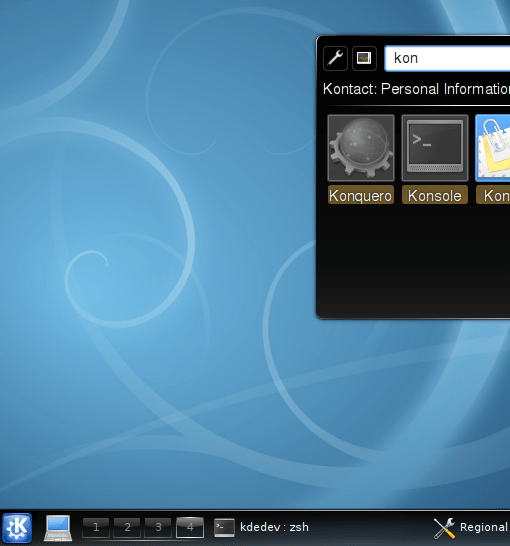
Tada! The first invisible start menu in the world?
This picture just shows a regular KDE4 desktop. Actually, my mockups are based on pictures from the KDE 4.1 Release Announcement. Now everything looks like normal, but let’s see what happens if we close KRunner and click on that blue KDE icon in the left corner.

*Click*
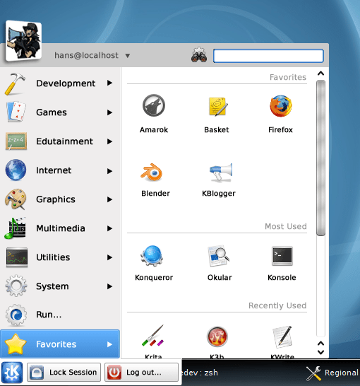
This is the Zetta Menu. Nothing really revolutionary, but there are probably a few things you’ll notice:
- The buttons are covering the panel
- The left part looks like the traditional menu
- ‘Favorites’ is already selected even though we just clicked on the menu icon
- The fonts are horrible!
As you can see, the menu isn’t ‘Oxygenized’ and doesn’t fit the overall Plasma theme. The reason is simple. The shininess of Oxygen isn’t really my style, and here I focused on the actual menu rather than its looks.
OK, so let’s divide the menu into its components and examine each thoroughly.
The Head

“So zetta… fast!”
This looks pretty familiar. The left part shows the user information: picture, user name and host name. The triangle indicates that you can switch users here, although I haven’t really thought about how it would work.
The right text field is, obviously, used to search for applications. It works in a similar way to the search bar in Kickoff.
The Body

KMenu merged with Dolphin?
The menu to the left shows the categories. I would prefer a ‘hover to activate’ system, but I don’t see a problem with making it configurable:
Hover mode: Similar to KMenu, the menu reacts on mouse hover (with a predefined delay).
Click mode: Click to change category.
The ‘Favorites’ section is shown be default, even when you haven’t hovered over/clicked on any category. This makes it possible to quickly launch your favorite or recently used applications. The hover delay prevents you from accidentally switching category when moving the mouse pointer to the icon view.
The icon view to the right resembles the one in Dolphin. The applications are shown as icons with their names displayed under. They can be rearranged with drag’n’drop or sorted by e.g. name. To add an application to your favorites, you can either use the right click menu or simply dragging the icon to the ‘Favorites’ category to the left.
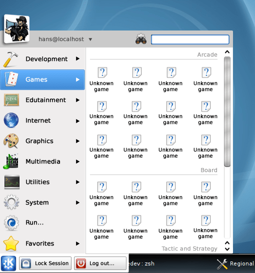
Now you might wonder how it would look if there are subcategories in a category. To show this, I’ve made a mockup of the ‘Games’ category.

Many unknown games for a known reason; mockup creators get tired too
Note that I’ve shrunk the icon and font size to be able to show more applications. The subcategories are shown as groups. Additional subcategories aren’t supported in this mockup.
The Foot

What happened to my pager?
I came up with this idea during a math lecture. Starting with the foot, I drew a whole menu beside my math notes.
Why are the buttons covering the panel? It makes the menu more compact, thus reducing the distance you have to move the mouse pointer.
Talking from my own experience, I never use the pager/taskbar/whatever item in the panel when I open the start menu. And when I thought about it, I’d never clicked somewhere in the panel to close the menu.
I agree that it looks a little bit scary at first, but I wonder how it would feel when you’ve gotten used to it?
Click on the KDE icon to close the menu. You might miss the ‘Switch User’ button, but as said above, I’ve let the Head of Zetta take care of user management.
The Extras
Here’s some more food for thought:
Application description
I’m not sure if there’s room to show the description under the name. Maybe the additional information can be displayed in a hover box? (Think Konqueror 3.5.x)
Icon size
The icon size should be configurable. But how about changing the size directly in the menu? Ctrl+Mouse wheel would be nice, but not easily discoverable. I was thinking about if a zoom widget would make any sense.

Zoom widget from the Open/Save dialog in trunk
Foot
I want to hear what you feel about the ‘covering the panel’ behavior. But please don’t judge Zetta solely because of this. If you feel everything else is alright, the foot can always be placed in a traditional way.

Oh yes, I added the ‘Switch User’ button just to fill the empty space
Size
This is a no-brainer: you should be able to resize the menu. I really like Lancelot’s way of doing this (dragging the borders).
Too many categories!
The icon and font size of the category items shrink/expand depending on the space available.
Keyboard Navigation
Being able to use the keyboard is important to me, but I haven’t given it much thought yet. Where should the focus be when the menu is opened? In the search bar like Kickoff?
Orientation
The menu should work in a pleasant way wherever you end up placing it. Right now I’ve only focused on where I usually have my KMenu icon, in the down left corner.
The End
This is only a concept at the moment, all of the pictures of Zetta was created by me in a graphics editing program.
You can add comments in the blog, but it might take some time until they’re approved. The best place for discussion would be in the new KDE forum.
Thank you for taking time to read this, I’m looking forward to hearing your thoughts on Zetta.


October 21, 2008 at 23:47
[…] Zetta – A new start menu […]